I just got back from viewing the
Arizona Biennial at the
Tucson Museum of Art, and I must say...this is a knock-out show. There are several pieces in this show that are truly world-class, and that's what I'll be focusing on in this review.
The themes that predominated in this show are: new ways to look at old discarded materials (i.e. as recyclables, or as vessels of some kind of spiritual force); issues of surveillance and control, appearance and reality, and issues of aging and change. There were also several pieces that dealt with formal art issues (such as color, composition, and what makes a painting a "painting") But for the most part, the best work (in my opinion was about
refuse (accent on the first syllable); garbage, and how we deal with it: recycle it, lock it up, put it under surveillance, paint it a pretty color so no one notices, ignore it, make art out of it. I'll explain more and describe the exhibit. Follow me...
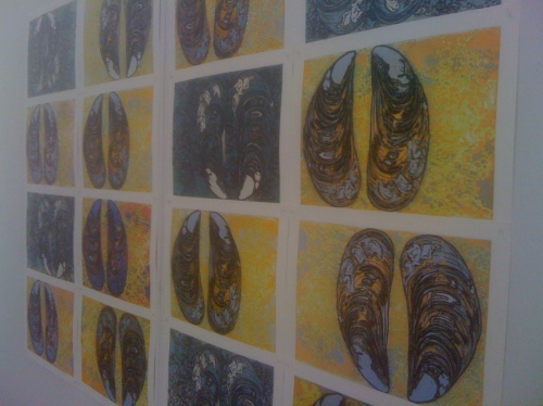
I started out by making a quick survey of the whole exhibit. I counted 27 photos, out of a total of 87 pieces of art (give or take 6 or 7 pieces, depending whether or not you counted an entire series as a single piece, or whether or not you counted each piece as a unique object) That means that about 25% of the Biennial was photography (although some photos stood alone as photos, others as components of a collage, and others as part of an installation piece). The next most predominant objects were paintings and sculptures (about 16 of each of those). But the artwork that really stole the show were the installation pieces. They were amazing. You want to be a great artist today? Consider your pieces, and how they fit in a certain environment. In fact, create the environment as well, because how we perceive any (art) object depends not only on the artistic qualities of the object itself, but also on its surrounding environment.
Right as you walk into the exhibit, you're confronted with
Julie Arnaud's large pair of photographs, which she calls
"Either/Or". What she's done is run these two large pictures (mugshots of a man and a woman) through a shredder, and then reassembled them, creating two hybrid photos of androgynous people, which are made of elements of each source photo. This was a good choice to put at the front of the exhibit, since it embodies several themes that will be revisited again and again: the use of shredded paper (shredded into strips) to make new art. The "stripe" motif was predominant in many works of art, either in the way a picture was composed (in a series of vertical or horizontal bars), or in the popularity of using shredded paper as an art material.
As you round the corner on the top floor of the museum, you're confronted with the huge installation piece, made of industrial felt, by artist
Saskia Jorda, called
"The Cartography of Memory". What you see is a large piece of white felt, suspended in the air by twine, which is actually the remainders material, from which the topo mape structures on the floor were cut. Using formal art terms, the "positive" shapes were cut out of the felt, and arranged and piled into "island" structures, while the "negative" shapes (i.e. the remainder piece of felt from which the "islands" were cut) is given a new function, as an additional piece of art. Hanging in the air, the refuse looks like a giant piece of rumpled Swiss cheese, or a big floating neural network (like a brain). It pours into the floor, with pools of piled concentric circles of felt, looking like a 3D topographical map. The effect looks like a giant brain pouring out memories, made of felt, at the floor.
But also, in addition to being an intriguing work of art, there's not one scrap of felt wasted! If there was an award for an efficient use of art materials, this piece would surely win something. This piece is very good because it touches on several current themes in art today: the idea of memory, the idea of maps (and mapping), and the issue of recycling.
 |
| Saskia Jorda's "Cartograms of Memory" (felt installation) |
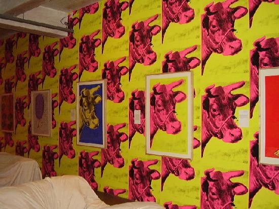
Adjacent to Saskia Jorda's piece is a wall installation by
Kathleen Scott Moore. It consists of a wall covered with a very peculiar wallpaper, on which hang two framed photographs, one of a man, one of a woman. The photos are arranged at far ends of the wall, in a way to suggest that each portrait is looking at the other. The wallpaper has a motif of silk screened revolvers on it, which evokes (to me) references to
Andy Warhol's wallpaper installation of cows -- although Moore has strived for an Old West nostalgic effect.
 |
| Kathleen Scott Moore: it looks old fashion, but on closer examination, it's totally modern |
She has two portraits on the walls, one of a man, and one of a woman, situation to look as if they're looking at each other. The photo process, however, isn't of the cowboy days. I would have expected a daguerreotype, or a process used by Matthew Brady (President Lincoln's photographer), which is more of the Old West period. But rather, it's an unusual "3D" process, where a high-resolution blue photo is printed on a piece of sheer fabric, which is stretched over a blue and white abstract painting of portrait (with only a swath of blue for hair, and a round area of white for a face), which when viewed straight on, appears to to have some depth to it, but it's no process from the Old West era that does 3D. From my knowledge of art history, I'd say that in the Old West era, there was straight on chemical-based photography, paintings, and silhouette paper cuts. Everything else is an anachronism. (If I'm wrong here, please let me know). Even the shape of the portrait is wrong: it should be a rectangle or (as in the case of portraits), an oval...but not a circle (as pictured above).
Let's consider the imagery on the wallpaper itself: First of all, notice the
stripe motif that I mentioned earlier in this review; here you see it again, with the strips of wallpaper (the black lines in this piece are actually strips of black ribbon adhered to the paper). Next, notice the intersecting pattern on the wallpaper. It looks like it was drawn by an
Spirograph, which was popular when I was a kid. Using the gun as a design element, their arrangement into a "two up/ two down" format, the odd "Spirograph" graphic that's also part of the wallpaper design, and the unusual photo process previously mentioned, makes it clear (to me) that
nothing in this display has anything to do with the history of the Old West (or those who lived in it), yet it does feel nostalgic and historic. So where's this feeling of nostalgia coming from? It's materials, designs, and arrangements are thoroughly modern, yet we read it as a window into an older time. What causes this illusion? The more I look at this piece, the more I like it, for it demonstrates that appearance is not always reality. Nice work, Kathleen!
Across the way, on the other side of this top gallery is a piece that caught my eye, by artist
Lisa Corine von Koch, called
"Thank You, Come Again, Please!". This piece include parts of real saguaro cactus ribs, into which she's build birds nests, out of shredded paper, for the Mexican Spotted Owl.
 |
| Lisa Corine von Koch: owl's nest made of shredded paper! |
It looks like she's emptied out her paper shredder, and used the strands of paper to weave these large basket-like objects, made of paper and long strands of videotape. This is a unique type of environmental activism: making dwellings for desert creatures out of your own trash. It's an artistic form of pollution. But, as she states in her artist statement, she's an artist who has a reverence for the natural world, but has knowledge of the hypocrisy of using materials that contribute to the degradation of the environment. A complicated piece. I like it for its heart, and for its humor.
In the east corner of the top floor, is a piece about surveillance, called
"Suspects" by artist
Denis Gillingwater. Perhaps it was fortuitous that this piece was placed right next to security guard. Whether intentional or not, the museum's security guard becomes part of this installation about surveillance, because he's right there next to it. As far as the qualities of the work itself go, it's a mixed media work, made with black and white photos of people looking at the Statue of Liberty (viewed from behind) with mirrors and surveillance cameras on them. The photo is stuck in a hard-to-access corner, and the only way you can get up close to it is to stand next to a CCTV security camera, and a fish-eye mirror. In fact, the surveillance equipment is so intrusive, that it's impossible to get a good view of the picture. You're always aware of that camera and that fish-eye lens.
 |
| Denis Gillwater's "Suspects": The exhibit that watches you watching it |
The camera is focused on a photo. The photo shows a picture of a man (in the foreground) raising his arm up to snap a photo of the Statue of Liberty. However, his pose mimics that of the Statue of Liberty itself. Lady Liberty holding up a torch has been replaced with a guy in a hoodie and a baseball cap holding up a camera. This piece really captures the spirit of the times.
 |
| Denis Gillwater (detail of photo): Statue of Liberty...you're under surveillance |
|
As you make your way down the sloping walkway of the Tucson Museum of Art, one of the first things you confront is
Josh Shaffer's installation, called
"Study of An Aftermath", which is looks like a disaster scene; it looks like someone attacked one of the museums walls, breaking a support beam, and exposing all sorts of copper tubing (used for plumbing).
 |
| Josh Schaffer's installation called "Study of An Aftermath" |
On closer inspection, we see that it's more than just a disaster: it's an idea about materials breaking free of their assigned roles, and grasping for freedom. Building materials are people too! This is a piece that has welded pieces of copper tubing (used from plumbing), broken apart and re-welded, and erupting from drywall. It looks like the aftermath of a scene where simple housing materials have come to life and have asserted themselves, bursting through the drywall as if to say, "Hey! We may just look like ordinary building materials, but we're artists too! Check this out!" Schaffer says in his artist statement that he seeks to "disrupt form and function of everyday objects, and express new meaning through abstraction". One of the things that the
Dada artists (and the surrealists) liked to do (about 100 years ago) was to make objects that were completely useless, such as the
fur-lined tea cup. Schaffer takes a similar approach by using building materials in ways that they were never intended.
Another work I liked is a tiny little painting by
Craig Cully called
"Defacing the Hairdresser's Husband". I love an artist who defaces his own work. Craig Cully is a very accomplished painter, who paints in a super-realistic style. But with this piece, Cully scribbles over this portrait (of a greying middle-aged man) with a black and purple Sharpie:
 |
| Craig Cully: defacing his own art |
In his artist statement, he says that his work revisits his "success with failure". I don't know why Cully writes things like that, because he's a great painter, and scribbling over preciously rendered portraits is a very brave thing to do. I really like this piece; it's a great combination of two styles. I like this direction he's taking. Keep it up, Craig!
A few steps away from Craig Cully's painting, is a really nice oil painting by
Rose Moon, called
"Mixed Presence". This is a painting of a graffiti-covered wall, with (what looks like) a San Francisco cityscape in the background. It uses a striped, or stratified-layer composition (as is popular with a lot of works in this show). I really like this piece because it's not just graffiti art (which I like), but rather, it's an
oil painting of a graffiti-covered wall, in its context.
 |
| Rose Moon: an urban sandwich; houses, a wall, and graffitti |
Moon, in her artist statement, suggests people ignore graffiti art if they see it on a city wall, but will notice it if its in a painting in an art gallery. It's odd, how we don't really look (at graffiti) unless there's some distance or a filter between it and us (I know I'm generalizing here). Or, to stay with the general gist of this review, Moon's painting is another example of an artist who considers the context of art in addition to the work itself: she didn't just make a painting of graffiti...she painted it in its natural context. She's not an installation artist, but she thinks like one.
Another piece I really got a kick out of was
Kelsey Viola Wiskirchen's "A Week In Review". In this piece, she wove a tapestry out of a copy of the
Sunday New York Times and the
Wall Street Journal.
 |
| Kelsey Viola Wiskirchen: recycling yesterday's papers to make today's art! |
Curt Brill has a sculpture in this show completely made of hemp fiber. It's in human form, larger than life, and looks like a scarecrow without clothes.
 |
| Curt Brill's "Faiba Niozo": hemp art! |
Without a doubt, the most ambitious artwork in the Biennial is
Miles Conrad's installation about
institutions (correctional, psychiatric, educational). He creates an environment where you're immersed in a sort of evil sanitarium. Situated in the corner in the back of museum (usually reserved for more "mature" themes) you're confronted with several very imposing-looking structures that look like they came straight out of jail or out of a psychiatric hospital. The walls are all painted black (reinforcing the feeling of darkness), and the only illumination comes from three light bulbs: two are hanging from the ceiling (with metal covers), and one looks more like a porch light. A sickening perfume-like smell of soap permeates the room. The objects in the room, all of a harsh, chunky, "institutional" style of design, all have a waxy greasy look. It quickly becomes apparent that everything in this room (the slump block walls, the bed, the desk, the bench, everything)...is cast out of
soap.
 |
| Miles Conrad's institutional sculpture, totally cast out of soap |
Everything in this work is carefully considered: the type of bed (thick, heavy, and cast iron in appearance), the type of wall, and the various accouterments (cafeteria tray, toothbrushes). Everything is cast out of soap, to reinforce the idea that ins are design to provide "cleanliness" from "vermin". But as you can see in the picture above, its not really designed to heal or to cure their patients, inmates, or students. Rather, institutions are designed to quarantine society from its "dirt" (hence the use of soap as a building material). But since it's all made of soap, and it smells like soap, there must something cleansing and wholesome coming from all of this, right? There's no privacy in any of Miles Conrad's architectural constructions; every wall has a window, as is evident from this picture of a soap bed, bisected by a soap wall, which comes complete with an observation window.
Closer examination of the bed reveals that it's got about 200 toothbrushes atop it, all cast out of soap, and arranged in an apple pie crust formation.Thoughts of an obsessive desire for cleanliness, and obsessive-compulsive disorder, come to mind. Obsessive teeth brushing, the obsession of casting hundreds of toothbrushes out of soap, and then arranging them in a very specific order...
 |
| What's all that criss-cross stuff on that bed made of soap? |
 |
| That's not apple pie crust! That's hundreds of toothbrushes, cast out of SOAP |
 |
| It looks like a shower...but it's another observation room made of soap |
There's also something that looks like a shower...the mat on the floor looks like an institutional rubber shower mat...but there's no shower. There's also no shower door. There's no water anywhere. The person who sits on the bench, however, is bathed in light, and that thing that looks like a shower door is actually an observation window. Once again, things are not what they seem. And in Conrad's "institution", you're always being watched (hence the prevalence of observation windows everywhere)
A companion exhibit, also created by Miles Conrad, (and included in the museum's back room area) is a series of seven sculpted phalluses, each resting atop a different psychiatric book, and each taking on a different theme. Here's one that is encrusted with roaches:
 |
| Conrad's roach encrusted penis cast that sits atop a psychiatry text |
This project is vast in scope, and obviously took a lot of work. Very memorable and intense exhibit. Miles Conrad is an amazing artist.
After exiting Miles Conrad's faux psychiatric prison ward, you're confronted with
Cameron Luft's joyful pieces of garbage wrapped in slick, shiny, highly glossed surfaces (enamel, resin, and fabric over garbage and recycling). In a way, it acts as a metaphor to Conrad's work.
 |
| Cameron Luft's artistically-sealed garbage: high fashion goat's heads?? |
My final stop in this exhibit came at the main floor, in the middle of the museum. There I saw a fabulous sculpture by artist
Benjamin William Phillips. At first, I didn't give it a second thought, since it looked kind of thrown together, until I read the artist statement, and realized that it was all intentional. As the artist says in his artist statement, this piece is about "the metamorphosis of aging as a man and a woman quietly and privately endure the natural ailments of growing older". You see two figures, and a wheelbarrow, falling apart, but continuing to move forward. This is another great piece of art. I can't help wondering if this piece didn't come together as an accident; as if the artist actually had two sculptures, and actually joined them together (thematically) with the wheelbarrow. Regardless, it's a great piece of work. Bravo!

...and that is my report on the Arizona Biennial 2011! An all-around very impressive show. This art is on par with any major exhibit you'd see anywhere in the world. See it while you can. Arizona Artists have got the right stuff! We all have reason to be proud of the talent in our own backyard.


