Tuesday, November 29, 2011

Melancholia (the movie): It gave me a headache!

"Melancholia" is showing at the Loft Theater.  This is not technically an art exhibit...or was it? I felt like reviewing it here, here's my impression of it.

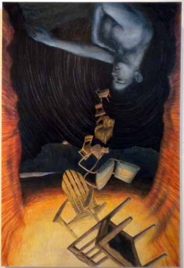
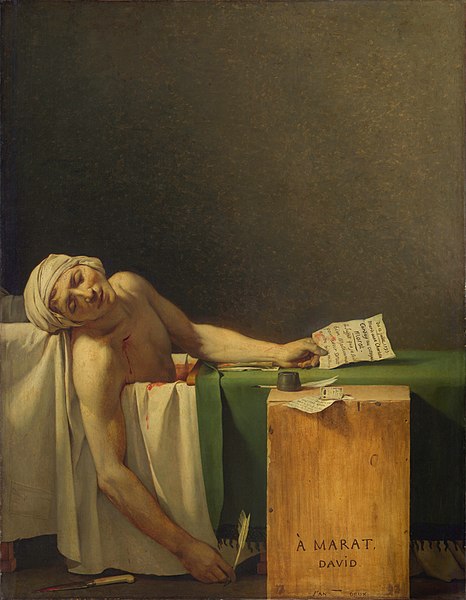
I was not one of those who are raving about this movie. I like the concept, I like some of the visuals (and their references to art history, notably "Ophelia" by John Everett Millais ("malaise"?) (and David's "Death of Marat", among others) but this movie gave me a headache. As I write this, I  still  have a headache. I went into this flick hoping to be transformed. What a disappointment!  I'm still the same, but now I have a headache!

I was hoping for a very moving, transformative piece about...I don't know, life, carpe diem, beauty and disaster, the "sublime"....  mainly because others have raved about this movie, saying how great it was. Maybe my expectations were too high??   In a nutshell, this movie feels as  if Ingmar Bergman and Andy Warhol collaborated to do a remake of the 1950's Sci-Fi flick, "When World's Collide"

 The context and emotional landscape are both from the 1950's: in the movies, we had the sci-fi disaster flicks, and on the literary front, we had existentialist philosophy.  This really is an existentialist movie, since it deals with the question "how would you live your life if you only had one day to live?"  One hopes, as the best existentialist writers said, that you'd approach you situation with courage.  This movie reminds me of some of Ingmar Bergman's films, which are also very long, brooding, and about messed up relationships. Here's a clip from Ingmar Bergman's "Persona", so you can get a feel for the mood, pace, and the long drawn out quality...

What "Melancholia" does is puts you in the mindset of someone who has no future (neither does the planet), and forces you to consider how you'd live your last day on Earth. What would you do?  You could freakout, and run around in a panic (as do the actors in "As World's Collide"), or you could try to negotiate a dignified exit in a situation in which its impossible to survive. (Here's the trailer for "When World's Collide")

The movie's opening introductory sequence (I'm talking about first 2-3 minutes of the film) are breathtakingly gorgeous. Lots of super slow motion surrealist montage. The beginning of the movie is like a silent short art movie unto itself. It brought tears to my eyes. It was a beautifully lush and graphically surreal portrayal of the disaster which creates the impetus for the film.  But after that first opening sequence, your endurance is severely tested.

The movie appears to be set up as a set of pairs: first, and most obviously, is the wedding couple itself: the pair which gets the movie started. Then there are two sisters, two planets (Earth and Melancholia), two halves of the movie (parts 1 & 2, each with it's own screen placard indicating just that, two passes around the Earth by Melancholia as it does it's "Dance Of Death". I'll stay within that tradition, and give this movie... 2 stars (no astronomical pun intended)

I mentioned that this film is part Sci Fi Disaster flick, and part homage to both Ingmar Bergman and Andy Warhol (his short movies that were at the Loft Theater last year). This movie has two winks at Warhol's short films: first, the quick, chopping, whiplash inducing camera work (to remind us that we're watching a film art object, not an illusion of reality). I'm thinking specifically of Warhol's film "My Hustler", which showed at the Loft last year, but which does not appear to be on YouTube.  In "Melancholia", as in "My Hustler", the camera is constantly moving around, jerking wildly, as if held by an amateur. I couldn't understand why I was getting car sick  watching this flick, but then it dawned on me: it's all of the jerky camera work!  I took a break in the lobby shortly after part 2 started, and chatted with one of the guys working at the snack bar.  He said that that jerky headache-inducing quality was intentional, so that we could feel the nausea that Kirsten Dunst's character was feeling. I believe him. There's no other good explanation for it.  A supporting argument for seeing shades of Warhol in this movie is the presence of Udo Kier, who starred in several of Warhol's later (more polished) movies, such as "Dracula" and "Frankenstein". (Here's a clip of Udo in Warhol's "Dracula", although in "Melancholia", he's an old distinguished looking servant

 The trailer for "Melancholia" is very deceptive, since it is fast paced. You get no sense of the long drawn out headache that's about to hit you (Here's the trailer)

Despite this, there are definitely many positive things about this picture: it's got a very intimate feeling;  you get a feeling as if you're really spending time with these characters. The topic (i.e. the End of the World) is grim, but it's set against some breathtakingly beautiful scenery. The ugliness actually comes from the people, and their pathetic lives.  Nature, and the Cosmos, are Beautiful. People, and their problems, don't quite measure up.

This movie presents you with a thought-experiment: you're getting married on the Earth's Last Day. Would that change your plans at all? It's something to think about. (As this movie suggests, loud grandiose Classical music helps move things along)


(c) 2011 by Howard Salmon


Sunday, November 13, 2011

3rd Annual Sculpture Garden Exhibit...at Tucson Jewish Community Center (13 Nov 2011)

A view of the sculpture garden at the Tucson Jewish Community Center
In conjunction with the "Open Studios" event, currently happening in Tucson this weekend, The Tucson Jewish Community Center hosted their 3rd Annual Sculpture Garden Exhibit. I caught it, with about 1/2 hr to spare, and with a light rain just starting... Here's how I saw  it!

This is a really nice exhibit. The JCC created a full-color explanatory booklet to go with the show, with an introduction written by Elaine King, who is a professor of Art Theory at Carnegie Mellon University. In her essay, she explains her selection criteria: work must be creative, and well-made: 

When I first entered, I was greeted by jazz music, by some cool cats. Here they art, jamming away...

Live jazz on sculpture garden patio. Coffee's inside...
Before looking at individual sculptures, I walked around the whole exhibit to get the lay of the land. I met sculptor Keven Burnett, who was still installing his sculpture called "Capricious Tongues". It looked like five weather vanes, but instead of arrows, they had tongues on a stick to point in the direction of the prevailing political winds....

Keven Burnett installing "Capricious Tongues"

cast iron wagging tongue on the end of a stick
Keven Burnett also created one of my favorite works in this show: sculpture of two men crawling up the side of the JCC, like Spiderman, each push a wire-frame boulder. The work is called "Sisyphus":

Keven Burnett's "Sisyphus"
Underneatch "Sisyphus", at ground level, is a sculpture by Lori Anderson  called "The Veteran". This piece looking like there's figure (presumably a soldier or a vet), wrapped up in what looks like are dragonfly wings.

Lori Anderson's "The Veteran"
Next to Lori Anderson's piece, is a very creative sculpture by Martha Dunham.  It is called "Forged Identity: Yitzak Rabin".  The sculpture depicts a large fingerprint.  The exhibit book has the artist stating that the human fingerprint represents life.
I wonder if that's HER fingerprint??

On the green grassy lawn, there is some art that is is definitly mimicing Nature: bent wire birds nests, created created by artists (or by some pretty strong birds) The nests are made of rusted coathanger wire and blue stone eggs.
Blue stone eggs in the center of a rusted wire cluster
One sculpture I really enjoyed was called "Agree to Disagree". It shows two abstract forms looking like two beached whales, hanging out under a swing set:

"Agree to Disagree"...giant figs having fun at the swingset
 Artist Tidi Ozeri has a sculpture here called "Tree of Knowledge". Here it is...

Tidi Ozeri's "Tree of Knowlege"

At the exhibit, I bumped into two local artists, Ben Oreck, and Vallerie Galloway! Ben is one of the sculptors in this show.

Valerie Galloway and Ben Oreck: making the sculpture scene!
...And that's my ever-so-brief art scene report...

Thursday, November 10, 2011

Janet Olsson's dark surrealism...at the Davis Dominguez Gallery


"...And The Woman On The Left" (c) 2011 by  Janet Olsson. Dark, cryptic, surreal imagery.
At the Davis-Dominguez gallery, artist Jan Olssen has an impressive number of paintings that all seem to be about various stages in a particular relationship. The relationship doesn't end well. The narrative (as I see it) starts in the small foyer area of the gallery, with pastel works on cardboard. The colors are very drab: lots of tints and greyed-down tones; washed out greens and pinks, with some chalky off-white regions, with pencil accents. I was remind of illustration from the 1950s. The composition, the subject matter, the color and style...it had a nostalgic feel. This is true of all of Jan Olsson's work here at this exhibit.  An overriding theme seemed to be memory.
"Seated Woman With Tape Measure and Iron":(c) 2011 by  Janet Olsson striking a nostalgic chord...
Olsson's piece "Seated Woman with a Tape Measure and Iron" is part of a series of pastel drawings that are all about a woman getting ready for ....something. There's picture of her ironing a garment, there's picture of her sewing at a sewing machine...several tight shots of a single women getting some clothes ready.   Another picture in the series shows a woman posing before a mirror, a man with a crew cut and wrapped in a trench coat, waiting for her...

"Man, Woman, and Heart" (c) 2011 by  Janet Olsson
"Man, Woman, and Heart" suggests some sort of romance of relationship, but only in the simplest of outlines. Again, muted pastel colors from another era dominate the picture. The drawings are quick and sketchy, and have the appearance of fashion illustration. A hot pink heart shape at the lower center of the picture helps further the idea that love is in bloom in this picture. But this relationship is about to go south, once you get into the larger gallery space...

"Girls" by Janet Olsson. Allusions to 'Alice in Wonderland'?  (c) 2011 by  Janet Olsson
When you enter the large room at Davis-Dominguez, you see more of Jan Olssen's work, but there are two new styles; there is a multi-media collage thing going on here. The painting "Girls" is a key piece in this exhibit is a sort of key to the show, I feel, because it contains a lot of clues about how to read the exhibit (at least to me). First, the work is structured in layers: Olssen combines photo collage, with splattered paint, with tinted drawings.  The drawings show two girls dressed up as if they were bridesmaids, or as if they were going to some fancy event. One is dressed in a red dress, the other in a blue one. The blond girl looks like Alice in Wonderland. Doesn't a part of "Alice in Wonderland" involve a red pill and a blue pill? Hmmm.... could this all be a dream? The "Alice" character is reaching out towards a big butterfly: a symbol of innocence and freedom. But as you look in the background, you notice a few white geysers of paint, along with some collaged photos of dirt, gravel, and some triangular foundation things (probably used for building a house); in the lower right corner are collaged photos of broken wooden palettes (used for loading heavy things onto a truck). So what does this all mean? A nice drawing of two girls going to a wedding, amidst a backdrop of dirt, damage, and disorder?
"Night Blooming" (c) 2011 by  Janet Olsson
By the time you get the painting "Night Blooming", things have turned chaotic. Once again,  Jan Olssen uses collage to build her pictures, starting with photos of broken up wood as a foundation (noticeable in the upper right portion of the picture above), on which she painting images of a child with a lost look on her face (lower right), several flowers (nightblooming cereus?; on the left...), an image of a woman with her hand on her face (crying?), and a ghostly outline of a man who looks very animated, but it's not clear what he's doing  (playing piano?)  Also, more splattered and dribbled white paint, over the flowers and shooting up to the right of the picture. With this picture, you feel as if you've walked into a scene of chaos. Olssen's work is very symbolic, but the symbols are all very personal, so to decipher the work, it's like trying to psychoanalyze the artist... My guess is that this picture is about a broken home. The figures in this painting do not look happy. They look like they're in various stages of distress, from anger, to grief, to shock. The chaotic photos (the "reality" of the picture) shows pictures of a home that is literally broken: broken boards, chunks of dirt and cement. So why the flowers? A symbol of hope? Of life? It's not clear...  This painting too has a washed out, monochromatic look; a barren look that looks like black and white TV, an old movie...the color of "memory"...

"Oracle" (c) 2011 by  Janet Olsson: Southwestern surrealism
 The painting "Oracle" is one of the best paintings in this show (along with "Treasure Hunt", which I'm describe momentarily). "Oracle" is a total surrealist southwestern tableaux. Olssen's limited colors (just black, white, and orange) magnify the already intense mood of this piece (with its crazed imagery).  This painting "Oracle" has elements common to the collage work previously described, but in this case, it is entirely painted. Even the drizzled white paint strewn across the canvas is also carefully rendered. Whereas in some of previous pieces I've described here, Olssen splattered actual white paint onto her work, in "Oracle" she carefully painted the shape of a paint splatter. Obviously that white paint drizzle shape has symbolic meaning for her, because it's present is most of her work in this exhibit.  She's got that same white paint splatter-type graffiti drizzled over many of her paintings. Maybe I should ask that dog in the background what's going on here? Other symbolic images here are the shrouded woman (a symbol of grief?), the dog (traditionally a symbol of loyalty), and those goofy ghost masks in the lower right. But that white splatter really dominates this picture. Is this the artist defacing her own picture? Is she drawing graffiti over her own work? Or is it simply a design element? I'm not really sure... Also, notice that the trashed wood palettes, the "broken home" has been replaced by an outhouse.  Or is that a dog house? I'm guessing that this picture is about betrayal...it all kinda adds up...
"Treasure Hunt" (c) 2011 by  Janet Olsson
In "Treasure Hunt", we see a bunch of sheep's heads (or are those goats?), woman standing in a puddle of white water  (or is it spilled milk? Or more white goo?)  In the background there is another house (or is that a barn?), with a forest on the upper left side of the picture. In the forest, in two places, stand two women (one on the upper left, holding an orange glowing thing behind her back), and the other waaay in the background in the upper right of the painting, standing nude and alone in a barren landscape.  At the very least, I can say that these images are about a sense of darkness and disorder.

"Best Man" (c) 2011 by  Janet Olsson
As I noted earlier, much of the work in Janet Olsson's exhibit is collage. Several of her pieces have a "Day of the Dead" quality about them, since they include photos of people from "Day of the Dead" parties. In the piece titled "Best Man", Olsson has followed her formula: she starts with a photo, adds collaged elements (a cake, a paper doll groom outfit), and again, more drizzled white paint. In this picture, she's made a halo of gold dots around the best man's head, all hastily done, as if an afterthought.

There's a very stark and angry quality about this work. You see it in the splattered paint. You see it in the images of (literally) broken homes, splintered wood, and chunks of concrete. You see it in the angular, disrupted compositions. You see it in the limited color palate. You see it in the symbols of death and mourning.

I like how she starts her paintings by collaging photos, and then using that as a foundation for a painting. I like how she creates a sense of moodiness and mystery, by limiting her colors to just one or two. I find her imagery disturbing, but that's fine: she does a good job of it.

This is art about loss and disappointment...and grief...and anger. The mood is dark, the compositions are active, and the imagery is surreal. This is painting for our times.

Thursday, November 3, 2011

Ruben Moreno's "Socratic Codices" @ Contreras Gallery (November 2011)

View of the Contreras Gallery, now showing Ruben Moreno's "Socratic Codices"
Local artist, Ruben Moreno, has a very ambitious and very impressive show at the Contreras Gallery.  It is highly conceptual in nature, and after spending a fair amount of time lingering over his 21 medium sized paintings, I came to this conclusion: Ruben needs to make a feature length film. He's got an imagination like Steven Spielberg, and he's got a sense of darkness and the macabre like Alfred Hitchcock.
 
Standing in the middle of the gallery, you're surrounded by the work, and even though it's very surreal, dreamlike, and "arty" in some of its imagery (that is, characters hold up objects, making them into symbols...but of what?) , it has a very personal feel.  It's risky making work like this which is so pedantic: at times, it feels a bit like the TV show "Lost"...with so much dream imagery, with cryptic titles, and with a philosophy about seeing the world as composed as a series of sets of four (e.g. "Four Elements", "Four Horsemen", "Four Main Emotions", and so on)  This type of one-size-fits-all philosophy can be a bit much to take (there are "fours" everywhere!), but Ruben's saving grace is that he invests so much of his personal life into the work, that it feels like a confession. He's put so much care in the drawing and execution of the paintings, that you can feel that has a respect for his subject matter, and also for his audience.
"The Four Emotions: Love, Hate, Joy, Sadness": A touch of Stephen King or Alfred Hitchcock?
I should say something about his painting technique: he doesn't use much paint. In fact, many of these pictures rely on the natural color of the wood grain ieft. There's no gesso here: it's all tinted and stained wood (blue and orange tend to be the predominant colors). These paintings are very minimally colored. They're actually more like tinted wooden boxes.

You can feel many of cross-currents and relationships between the various pictures: this is a body of work that gives you big hug: it feels like a big family of images.  But that's its "weakness" too: each work has its strength when in the community of all the other paintings, but is diminished when each is considered alone. The strength of the "Socratic Codices" is in the community of paintings. To see only one of these paintings is to see this work out of context.  Ruben's work has a cumulative effect, and the more you see, the more you understand his epic idea. Which is why I see the next logical place for Ruben to go is Hollywood! With ideas this vast, he should probably make an epic-length film. His images all seem like movie posters anyhow. But back to the exhibit...
Moreno's "Four Stages of Sleep: Beta, Alpha, Delta, Theta": A touch of "Vertigo"?

This show is not merely a body of artwork. Rather, it's an illustrated "codex" (Ruben's term) of symbols, situations, and dream sequences that feel very much at home with artwork  by other surrealists, such as Rene Magritte or Salvidor Dali.  There's a philosophy, and a mystical point of view that underlies all of this work: to decipher the "code", you've just got to study the pictures. But there's mystery to it, because it's not clear to what the connections are all about.

 One of the curiosities of this show (out of many) and the incredibly long titles, which read more like paragraphs quoted from some textbook. For example, one picture shows a young man "removing" a girls heart (Aztec style?), under the Eiffel Tower at night. Paris has vanished (judging from the barren landscape typical of artwork by Dali or DeChirico), and only a few symbols remain (the hawk flying through the back of the picture is a common motif in this work).
Ruben Moreno's "The Mammalian Heart Consists of Four Chambers..."
The title of the work isn't really a title at all, but rather, a paragraph from a textbook. The title of the work shown above is "The Mammalian Heart consists of four chambers: the right and left atriums, the right and left ventricles".  

 In the image below, Moreno offers his vision of the Garden of Eden, in his painting called: "The Four Rivers of the Garden of Eden"

Figures who resemble Samuel Jackson & Lauryn Hill star in Moreno's "Four Rivers of the Garden of Eden"

Moreno's "Four Dimensions of Mindfulness"
My favorite painting in the show is called "Four Dimensions of Mindfulness".  It shows a picture of four nude figures in a forest (or is it two, standing before a mirror?) It's the one painting here that has a sense of deep space; of an environment where the viewer can step into.  I like the sense of alternate reality, or is that a door to another dimension? Plus, Moreno treats us to four unique views of four young beautiful women. What's not to like??

 When you walk into this show, and study some of the imagery, you feel as if you've walked into a maze.  I'm reminded of a classic video game called "Myst": you wake up in a mysterious place, and its up to you to figure out what's going on. Same vibe here; the more you look at it, the more you get drawn in..... Moreno's combined surrealism, with a sense of history (both his own, as well as that of pre-Colombian cultures), along with a penchant for Western Philosophy (that is, Aristotle's categories), and an obvious love of "Heavy Metal" styled illustration.  He obviously spent a lot of time thinking about this work, and planning the images, before he set down to painting them.  The end result is epic: you feel like you're in the middle of something great. 

Michael Contreras (of the Contreras Gallery) tells me that the 21 paintings on display here are only a beginning, for Ruben plans to make a total of 80 paintings in all! That could take years. And the more of this work we see, the more we'll understand...or will we? Yes, these painting ARE like the TV show LOST!

But I like the way Ruben thinks. He's thinking on an epic scale, and how all of his 80 paintings will form a monumental masterwork, that is at once surreal, dark, sad, fearful, cryptic, sentimental, stylish, honest, arty, and bold.

It's about time we had an artist who thought big! We should celebrate this emerging talent in our midst!